

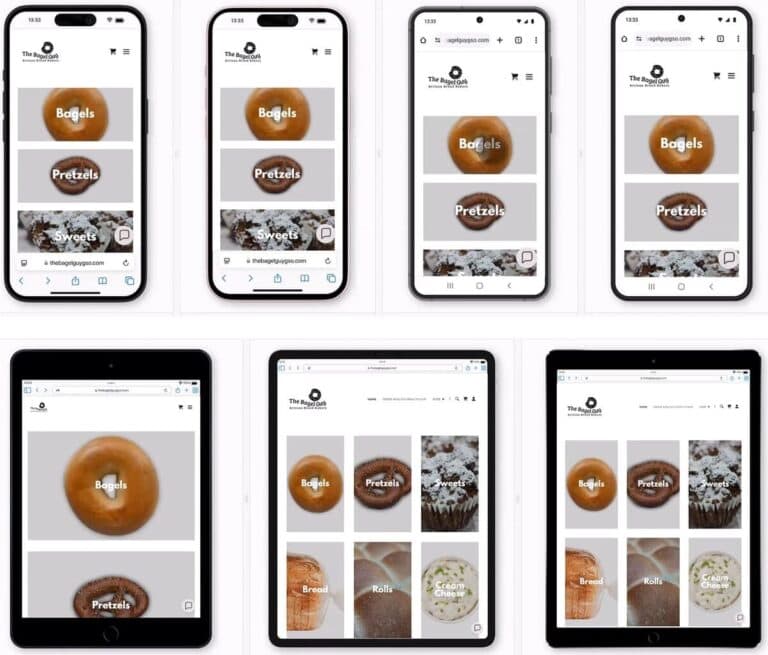
According to a recent AI Website Audit I ran using My Web Audit, these are the elements that should be considered when analyzing a site for mobile optimization.
Audit Points
Mobile Responsiveness
- Mobile optimization ensures a website’s design and content adapt seamlessly across all devices, enhancing overall user experience, boosting engagement, reducing bounce rates, and supporting conversions site-wide.
Why it matters: In today’s mobile-first world, over 60% of web traffic comes from mobile devices. Poor mobile optimization can lead to lost sales, damaged brand reputation, and lower search engine rankings, as Google prioritizes mobile-friendly websites in its rankings.
Mobile Rendering Optimization
- A website optimized for mobile rendering ensures that content displays correctly, fits within the mobile screen, and provides a smooth visual experience without the need for zooming, excessive scrolling, or encountering layout issues.
- Why it matters: Users abandon websites that don’t render properly on their devices within seconds. Proper mobile rendering directly impacts user satisfaction, time spent on site, and conversion rates, with studies showing that 53% of mobile users leave sites that take longer than 3 seconds to load.
Hero Section / Above the Fold
- The hero section is the first thing visitors see on your mobile website, making it crucial to capture their attention and guide them toward the intended action.
- Why it matters: Users form first impressions within 50 milliseconds of landing on a website. The hero section is your primary opportunity to communicate value and drive engagement, with studies showing that effective above-the-fold content can increase conversion rates by up to 50%.
Calls-to-Action
- The CTA is the driving force behind conversions, so it must be clearly visible, easy to interact with, and positioned where users are most likely to engage with it.
- Why it matters: Well-designed CTAs can increase conversion rates by up to 200%. Mobile users specifically need larger, clearer buttons due to the “fat finger” problem, with research showing that touch targets should be at least 44×44 pixels for optimal usability.
Overlapping Text & Images
- When text and images overlap, it creates a poor user experience by making content difficult to read or interact with. On mobile devices, this can lead to increased bounce rates and lower conversions.
- Why it matters: Text legibility directly impacts comprehension and trust. Studies show that users spend 20% less time reading content that has poor contrast or overlaps with images, potentially missing crucial information about products or services.
Text Readability & Contrast
- Clear, readable text is essential for mobile users to quickly understand your message and take action. Poor readability can lead to user frustration and increased bounce rates.
- Why it matters: WCAG guidelines recommend a minimum contrast ratio of 4.5:1 for standard text. Meeting these standards not only improves accessibility but can increase reading comprehension by up to 40% for all users.
Whitespace & Spacing
- Whitespace plays an important role in making content easy to consume on mobile devices, preventing the page from feeling cluttered and helping guide users to key elements.
- Why it matters: Proper use of whitespace can increase comprehension by up to 20% and user engagement by up to 30%. Strategic spacing helps mobile users accurately tap interface elements and reduces cognitive load while browsing.
18 Questions to Ask when Evaluating Mobile Responsiveness
- Does all content fit within the mobile viewport, with no horizontal scrolling or elements extending beyond the visible area?
- Are images, text, and buttons appropriately sized for mobile, maintaining clarity and usability?
- Does the layout follow a single-column, mobile-friendly format, making navigation straightforward?
- Does the hero section have a clear headline, supporting text, or a visible CTA above the fold, beyond just the logo and navigation?
- Are key offerings and value propositions immediately visible without scrolling?
- Is the first visible product image appearing above the fold to engage users instantly?
- Is there a clear and prominent CTA visible above the fold, or must users scroll to see product categories?
- Do product category images use standard CTA button styles or text?
- Is there a visually distinct button or link encouraging immediate action, such as “Order Now” or “Shop All”?
- Is all text clearly separated from images with no overlapping?
- Are product names placed over images with sufficient contrast and spacing to maintain readability?
- Does the layout avoid interference between text and visual elements throughout the page?
- Is text large, bold, and easy to read against background images and solid backgrounds?
- Is there strong contrast between text and background, especially on product images and informational sections?
- Are font size and spacing appropriate for mobile viewing, supporting legibility?
- Is there generous whitespace between product sections and text elements to prevent visual clutter?
- Is spacing between navigation, product images, and footer content well-balanced for mobile screens?
- Does the overall layout feel clean and easy to navigate, guiding users through the page logically?
A Tool That Can Help
OMG! That is a ton of questions and answering them manually is a BEAR! But there is a tool out there that makes it wayyyy easier.
Blisk.io is a specialized web browser that allows simultaneous testing of websites across multiple devices and screen sizes in a single window, offering real-time synchronized browsing across all device views. Unlike standard browsers, Blisk focuses exclusively on development needs with integrated device emulation for iOS, Android, and various screen resolutions, making it easier to identify and fix cross-platform design issues during the development process.
The Mobile Optimization Bottom Line
Thorough mobile optimization isn’t just about checking boxes—it’s about creating seamless experiences that drive real business results. By systematically evaluating these key elements—from viewport rendering to whitespace utilization—you’re positioned to deliver websites that truly perform in today’s mobile-first world.